The Peace Intel design system: the foundations, the components and the templates,
each built from the shipping CSS. Start here, take what is Stable, and ask before
shipping anything in Open decisions.
The Peace Intel design system, for the developer adopting it and the designers who come
after. Every plate is built from the shipping CSS, so what you see is what the code does.
Each one says whether it is Stable, which may ship, or an
Exploration, which may not without asking. Explorations are gathered at
the end, in Open decisions; how anything was decided is in the archive.
Three principleswhat every page should look like it follows
The evidence leads
Citations, tier marks and the source line carry the brand. Nothing decorative competes with them, and nothing is said without saying where it came from.
Ink on paper, one accent
Monochrome throughout, texture and imagery included. The orange marks only what you can act on and what cites; it never carries a state or a decoration.
Print history, made by a machine
A serif set light for what is read, a mono for what is measured, and the dither and pixel marks: an old discipline drawn on purpose by software.
The five rules broken mostthe rest are in AGENTS.md
No literal values
Every colour, size, space, radius and weight is a token. A raw value in a page is off the system.
Fix it at the base
A block that looks wrong is fixed in components.css, never overridden in one page.
Motion is a closed set
Use the existing primitives by class. A new @keyframes or entry transition is a bug; propose a primitive instead.
Contrast is measured
--accent for graphics and large type, --accent-text for text under 24px, and every pair checked on the surface it sits on.
One loud thing per page
One hero motion, one accent action leading. Everything else steps down a tier.
Which file, for whatif two disagree, the CSS wins and the explanation is the bug
tokens.css
Every value: colour, type, space, radius, weight, motion. The source of truth.
components.css
The stable blocks. Anything here may ship.
explorations.css
Shapes waiting on a decision. Not for production without asking.
system.js
The runtime: entry motion, the rendered grid, media, the page drivers.
AGENTS.md
The rules, written for people and for coding agents.
HANDOFF.md
Adopting the system in the production repo: what to change, where, in what order.
tokens.json
The tokens for tools (DTCG format), generated from tokens.css.
The console written down: behaviour, breakpoints, what is mock, and what production has that the prototype does not.
archive.html
Not in this copy: Matt’s record of what was cut. A mention of the archive, or a code starting AR, is history; there is nothing to look up.
Part one
Foundations
The measured parts every page is built from: colour, type, space, surfaces, texture, the logo, imagery and motion.
Pl. 01ColourStable · contrast measured live
Ink on paper, and one accent.
Contrast ratios are computed live from the rendered CSS. They are measured
against --ground, the tone a band or a tray sits in, rather than the
page background, so a token that passes here passes anywhere on the page. The
console’s sides sit on --ground-2, the darkest tone text goes on;
there --ink-55 is the floor for small text.
Textratios vs the current surface
Surfaces & linesborders stay alpha so they composite on any surface
Two tones besides the page, and a face and a fill made from them. A tone sets back: --ground for a band or the tray’s recess, --ground-2 for the console’s sides and project page. An edge makes an object: --edge (1px of --line-2) round --face, which is the page tone. --fill is the ground’s tone on a small object meant to be quieter than its neighbours, a badge, an avatar, your own message. Which to use where is Pl. 04.
Accent--accent for graphics and large type · --accent-text under 24px
Warm--warm · three uses, and no fourth
The July paper tone. It is a colour, not a surface, and it is
documented here rather than in Pl. 04 because that distinction is the whole
rule. There was a .surface--warm band in the surfaces plate and it
has been removed: a band of warm turns the emphasis tone into a second page
tone, which is exactly how the tone stopped meaning anything the first time.
Warm earns its place by being rare, and a section background is never rare.
Use 1
Callouts
A note pulled out of the flow to be read on its own.
Use 2
Violators
Now in pilot
A badge that breaks its own container.
Was use 3
Gradient fields, removed
The fields were built from this tone and were removed on 15 October; they are in the archive. Warm has two jobs now.
If two warm things are visible at once, something is over-emphasised. If a
grid of cards is warm, that is the old system leaking through and the job
belongs to .card.raised.
Pl. 02TypeStable · Source Serif 4 · Barlow · Space Mono
A light serif, a workhorse, an instrument.
Source Serif 4 for what is read as a headline, set light: 400 at every size, the two
largest included (--serif-w-display was 500 until 16 October, when display
grew from 46 to 64px and the size took over the weight’s job). Barlow for
everything read at length, at 16px. Space Mono for labels, readings and the eyebrow
ladder. Nothing serif is bold, and nothing is set below 10px.
The sans is Barlow (16 October), at the system’s own tracking. DIN 2014 would have needed a paid web licence; Barlow is free under the SIL Open Font License, has a true SemiBold for 600, and covers the same languages as the serif. It was chosen in the sans test over Clear Sans and D-DIN, neither of which has a 600.
The serif is never set in capitals. A label in capitals is the instrument
register, so it is set in the mono (.eyebrow): Key assertions, Details, Summary,
Sources. Source Serif in capitals reads as a wedding invitation, and its small sizes lose
their shape. The console’s serif heading rule leaves any heading marked
.eyebrow in the mono, so a label can be a real heading.
Headlines stay to two lines. At 64px a headline of about 32 to 40
characters fits on two lines in the hero’s measure; the studied gallery heroes have a
median of five words. A longer thought is a headline plus a lede, not a longer headline.
Home’s (69 characters) and Rotary’s (89) run to four lines at the new size and are
the first to rewrite. This is a note for writers, not a rule the CSS enforces.
Type scale10 steps · replaces 32 ad-hoc sizes
Typeface rolesSource Serif 4 (15 Oct, after Nanum Myeongjo) / Barlow (16 Oct, after DIN 2014) / Space Mono · serif headings at 400 at every size
--serif · editorial
Every answer, traced back to the source.
--sans · workhorse
Ask a question, get an answer with receipts
--mono · instrument
Evidence · 12 sources · updated today
Line breaksadded 8 Oct · headings balance, paragraphs avoid a lone last word
Evidence-based answers to long-term questions, in Peace Intel.
Headings take text-wrap: balance, so a 20ch measure stops ending on
one word. Paragraphs take pretty, which only avoids a lone last word
and keeps the ragged edge. Balancing
once split the product name across two lines, so in a heading it is written
Peace Intel.
Mono, uppercase, tracked, small.
Nearly all UI chrome is an eyebrow. Four steps and nothing else: the prototype
pages had thirteen distinct letter-spacing values plus three in raw pixels.
Tracking scales inversely with size. Shown on all three surfaces.
The accent eyebrow names a state, decided 9 Oct. It is for a label that says
what the accent already means: evidence held (Ingested, Tier 1), a
verdict (Correct, Decided), something live (Now in pilot).
Section labels, card categories and numbered lists stay neutral, however important.
Refined on 15 October. Each step is a one-pixel contact shadow that gives the edge a
foot, plus a short ambient shadow pulled in so it never shows past the sides: paper
resting on paper. A card never takes one on hover (that is the echo, below);
elev-1 is a chosen tile or a hovered call to action,
elev-2 a prompt or the console at rest, elev-3 the same
under focus.
Four, everywhere.
Every corner in the system is 4px: buttons, inputs, cards, pills, chips, badges, the
focus ring. It was two steps, 2px for small things and 4px for anything with an interior,
until 15 October. One answer is one fewer place for two components to disagree, and a
chip and the button beside it now read as the same family of object. Round things, a
status dot or an avatar, take --r-full, because a dot is not a corner.
The token names all stay, so a component keeps the name that says what it is; never
write a literal in place of one.
Pl. 04Surfaces & linesStable · grounds, objects, lines, the exception
A page is a sequence of surfaces.
One page tone with occasional cards on it reads as monotonous no matter how
good the tone is. A surface context remaps the semantic tokens for
everything inside it, so the same markup works on any of them with no
overrides. Alternating them down a page is the whole fix.
There are five, and there is no warm one. A band of the emphasis
tone turns it into a second page tone, so warm is documented in Pl. 01 as a
colour with three uses. That is the difference between a colour and a surface
and it is worth holding: a surface is somewhere components live, a colour is
something a component is.
A page may have more than one dark section (15 October). There is no
dark theme; it was removed on 14 October as too heavy for the brand. A dark band is
the strongest emphasis in the system and costs no chroma, which makes it the right
tool for a reader who will not be shouted at: the closing call to action, a single
claim, the figure the page exists for, the footer. Two dark bands never sit back to
back; a light band goes between them.
(default) · page tone
The baseline. Most bands are this, or the page has no rhythm to break.
.surface--ground · set back
One step back: the band takes a 2% wash of ink, and a card on it keeps the page tone, so the card is what lifts.
Every band above uses identical markup. No .surface--invert .pill
override exists anywhere, and there is no dark variant of any component.
Tone sets back. The edge makes an object.
The system has one tone besides the page, a wash of ink, and one line, the hairline.
They never do each other’s job. A tone says “set back”:
a band, the console’s sides, the recess a choice sits in. An edge says
“object”: a card, an input, a library entry, and its face is the page
tone, so on a ground it is the brightest thing and reads as lifted. Warm is the
exception, kept for callouts and violators.
Renamed on 16 October. The tone was called --panel, a name
that means a raised board, while the console used it as a background. Both uses mean
“quieter than the page”, so the tone keeps one meaning and the names now say
which job is being done. Three small objects are filled with it, a badge, an avatar and
your own message, because each is meant to be quieter than what is beside it: your
question is quieter than the answer. That is the tone’s meaning at object size, not a
second meaning, so it does not dilute the language. What would: a card filled with it on
the page, or a ground with an edge round it.
--ground
A region set back from the page: a band (.surface--ground), the tray’s recess. Two percent of ink. Was --panel.
--ground-2
Further back: the console’s rail, library and project page (.surface--ground-2). Four percent, the darkest tone text sits on; --ink-55 measures 4.76:1 on it. New.
--face
The face of an object on a ground: a card, a library entry, the open chat in the rail. The page tone. Was --panel-face.
--fill
A small object that is itself set back: a badge, an avatar, your message. The ground’s tone at object size. New.
--edge
An object’s hairline, 1px of --line-2. Was --panel-border; --panel-elev, always none, is gone.
Former names
--panel, --panel-face and --panel-border stay as aliases for production’s console.css only. Nothing here uses them.
The treatmentdecided 9 Oct · the edge, and only the edge
A card is raised by its edge: a hairline at --line-2 around the page tone,
with no shadow until it can be acted on. That is
.card as it ships, and it was .surf--edge in the comparison that
settled it. Corners, the second treatment, and the five surfaces weighed against the
edge are in the archive.
The surface, everywhere it appearsone treatment, no overrides
Card
Edge plus face.
The ordinary object. Quiet enough to use on every card on a page without the page becoming a texture.
Selected row
Chat bubble · --fill
What happened in Darfur between 2003 and 2011?
The exceptionwarm, in its two jobs
Callout
A note pulled out of the flow to be read on its own. This is what the warm tone is good at, and now it is most of what it does.
Pilot onlyViolator
A badge that breaks the edge.
The print term, and it is literal: it violates the boundary on purpose. One per container, or it is just a row of badges.
Those two, and nothing else; the third, the gradient fields, was removed on 15 October. A warm card in a grid of cards is the old system leaking
through.
Components read these tokens rather than assuming a fill exists. Anything that hardcodes
a background and adds its own border will not follow a change here, which is exactly how
the live site ended up with two of everything.
Lines, as they standevery line the system draws, and its one job · new grammars are in Pl. 16
Two rules cover all of them. Weight is state: a 1px line is structure, a 2px line marks where you are or what is evidence. Colour is role:--line decorates, --line-2 bounds what you act on and opens a group, --ink-35 is an edge under the pointer, ink is position, the accent is evidence.
Divider1px --line
Between things that are not objects: the nav’s foot, table rows, steps, the console’s columns. Decoration; nothing depends on seeing it.
Edge--edge
A closed hairline makes an object: a card, an input, a library entry. Never on a ground, a band or a section.
Edge, darkened1px --ink-35
An object under the pointer. The whole hover for a card; no shadow, no lift.
Rule row.rule-row · .points
One rule on top, verticals only between two items, the outer edges open and the outer text flush with the heading. Fixed on 16 October: a wrapped row left a line at its right edge.
Ledger.ledger
The rule row on its side: a hairline over each entry, the first at --line-2 because it opens the group.
Tab2px ink
Where you are: the margin’s tab on a section’s hairline, the strip’s current section, the chosen answer mode.
a blankUnderline2px ink · 1px --ink-35
A choice inside a sentence takes the 2px rule (.blank); a text link takes 1px that darkens to ink under the pointer.
Accent rule2px --accent
Evidence pulled out of the flow: a callout, a report’s finding. The only coloured line.
Legend.obj
A label set into an object’s top edge, breaking it, to say what kind of thing it is (Pl. 11).
Bracketsthe logo
The focus corners of the logo and the favicon. They stay in the mark: tried as a page line on 16 October, they read as too literal.
Pl. 05TextureStable · the dashed grid, still or rendered
Use it freely. Never two in a row.
The dashed grid can run on as many sections of a page as want it (15 October; it used
to be rationed). Two rules hold. It always fades: every textured region
takes a mask, so the grid is never a hard-edged rectangle. Two textured
sections never touch: put a plain band between them, or the two fades meet and
the grid reads as wallpaper with a crease in it. Anything sitting on the grid is opaque.
Six maskscentre · top · band · left · right · bottom
.textured
.textured--top
.textured--band
.textured--left
.textured--right
.textured--bottom
Left and right are new. Each holds the grid on one side and fades it out across the
other, and fades top and bottom as well, so no edge is hard. Put copy on the clear
side. .textured--side, the right-hand fade that stays clear under a hero’s
copy, is still in the catalog for the hero. .textured--bottom (15 October) holds the grid at the foot and
fades it out upward, full width: the console’s chat sits on it, so the grid gathers
under the composer and the conversation above reads on clear paper.
Opaque cards on texturethe reason every surface in the system is opaque
Correct
Opaque face.
The card hides the grid behind it, so it reads as a solid object sitting above the texture.
Wrong
Translucent face.
The dashes show through. It stops reading as depth and starts reading as a dirty scan.
The rendered grid.
The same dashed grid, developing cell by cell as its band scrolls in and dissolving as it
leaves: scroll-linked, never looped, in ink only. Cells arrive in an organic order, white
noise mixed with a slow value noise, so the texture assembles in patches the way an image
develops. It keeps the vignette, and nothing legible depends on it: with script off or
motion reduced, the still grid shows instead.
At 3× weight, so it reads at this size
<section class="band gx gx--render" data-gx> with a
<canvas class="gx-c"> as its first child. The driver is
gridRender() in system.js. Same rule as
.textured: two textured sections never touch, and anything set on it is
opaque. landing.html’s corpus band and rotary.html’s
closing band use it.
At band scaleproduction weight
The rendered grid
Texture that develops as you arrive.
Each cell waits for its own threshold, so the grid assembles the way a dithered image resolves, and lets go as the band leaves.
Pl. 06Logo, line & faviconStable
The bracketed dove, and the name beside it.
The logo is one lockup, an image: the dove in its brackets, drawn in the dither, and
PEACE INTEL set beside it. It is always the file, never typed, and never in colour. This is
version 6 (16 October), from Matt’s Figma masters in Resources/Logos/:
the name is two words, as it is in a sentence, and the brackets are heavier.
On papermedia/peaceintel-logo-light.pngOn a dark bandmedia/peaceintel-logo-dark.pngClear spaceHalf the logo’s height on every side. No type, rule or other logo inside it.
Sizethe image scales; the rules do not
--logo-h · 34px · the site nav--logo-h-sm · 30px · phones24px · the console bar, the smallestUnder 24px, the brackets alone
The name in a heading or a sentence is “Peace Intel”, two words. As a logo it is only ever the image; never set PEACE_INTEL in the mono with an underscore, which was an earlier lockup.
Ink or paper, nothing else
Ink on paper, paper on a dark band. Never in the accent, never recoloured, outlined or shadowed, and never over texture or a veil where the grid would cross it.
With partners
Peace Intel leads at its own size. Partner logos sit in an .orgs row (Pl. 12) after a mono label, such as “A project of”, at matched height and in greyscale. Co-branding with Rotary needs Rotary International’s approval.
The brand line.
One line, chosen 16 October from seven, for clarity and trust with an institutional reader. It goes wherever the brand speaks in a few words: under the logo, on the brand board, a report’s cover, a deck’s title slide, a badge. It is a sentence, so it ends with a full stop, and it is set in the serif in sentence case, never in capitals.
Clear evidence for consequential decisions.
Word for word
Never shortened, reworded or split over a logo. Where there is no room for all five words, there is no room for the line.
Under the logo, not beside it
A gutter of the logo’s height below it, left-aligned with the brackets, at --t-h3 or larger, in --ink.
Not a headline
Pages keep their own headlines. Home’s, “Decisions on peace and security are too important to leave to chance.”, stays Home’s, and is not the brand’s line.
On a page, the logo and the line are .brand-sign: the logo’s img, then p.brand-line at --t-h2. Home’s footer opens with it, on the dark logo.
Pl. 07ImageryStable tiers · the veil is an Exploration
One loud thing per page.
Four tiers of image and motion. At most one tier-one element per page, and
never two tiers competing in the same viewport. Without the rule a page ends
up with a hero video, a section video and a grid texture all fighting, which
reads as noise rather than atmosphere.
Tier 1
Hero motion
Dithered loop behind the headline. One per page.
Tier 2
Band texture
Dithered loop behind a section. One per band.
Tier 3
Figure
A still diagram, chart or specimen. Framed, opaque.
Tier 4
Grid vignette
The dashed texture. As often as a page wants, always faded, and never on two sections that touch.
All motion assets share one treatment: medium cell, seven percent mono Bayer
dither, greyscale, multiply blend. That treatment is the brand's image
language, so a new asset that is not dithered will look like it came from
somewhere else. On dark surfaces the blend switches to screen, because
multiply would erase the asset entirely.
The dashed grid is fine to use. What is not fine is a hard-edged rectangle of
it. Every texture has to fade out, through a vignette mask, a
band mask, or the algorithmic falloff the canvas version uses. An unmasked
texture reads as a panel that someone forgot to style; the same texture with
its edges dissolved reads as atmosphere. That is the whole difference, and it
is one line of mask-image. Texture also does not go on top of
imagery — two textures in one rectangle read as a screen door, which is why
the grid came off the stage in Pl. 05.
The veil.
A subject shot on white, a dove or an object on a seamless, dithered and blended into the
page so the ground disappears and the subject floats with no box and no edge. It is a
quality of the page rather than an object on it, so it sits behind type,
and the copy over it needs no opaque face. Its still form, .vmap--still, maps
a photograph of a subject through the same monochrome ramp; Home and Rotary use it for
figures. The video map, footage that fills its frame, is retired for now and in the archive.
The veil, with copy on itwhat the dove and the glass always were
Tier one
Nothing here needs an opaque face.
The type is ordinary markup on the page background, because as far as the copy is
concerned the veil is behind the page rather than on it. No contrast exception, no
card, and it is all still legible with the video missing. That is the whole
advantage over a texture or a panel, which is a surface and has to be treated as one.
The veil, with copy on it, on a dark bandthe same clip, inverted and screened
Tier one
The same dove, drawn in paper tone.
On a dark band the clip is inverted and screened instead of multiplied, so the white
ground drops to the band and the dove is drawn in light. The type is still ordinary
markup on the band, legible with the video missing.
Greyscale, multiply onto the paper, at .18 for a hero; below about .10 the subject
disappears. The grain is the original site’s: a veil master is about 1.5×
narrower than the width it is drawn at, with a 2px baked cell, so it lands on the 3px
brand cell on screen. The edges always fade, and the mask is part of the
class: a veil with a hard boundary is a video element. One moving clip per page; past two
on screen the cost of compositing the upscaled frames climbs steeply.
Still figures, as a seriesthe five stills from Rotary’s .scrolly--flip.scrolly--full · .vmap--still
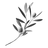
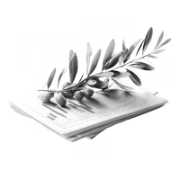
A subject shot on a seamless, mapped through the clips’ ramp so its ground drops into the page. On Rotary’s “From idea to application” one motif, the olive branch, runs through all five, so five images read as one story told in steps: the sprig alone, then round the globe, across the evidence, under the clipboard’s clip, and resting on the result. Give a series one recurring subject; five unrelated objects would read as clip art.
01 · The sprig, aloneThe motif on its own: the section’s opening, before any step.
02 · Around the globeWhere: the country and the conflict context.
03 · Across the evidenceWhat has been tried, and how strong it is.
04 · Under the clipThe funder’s criteria, checked.
05 · On the resultThe application, finished.
One still, on each surfacestop 0 of the ramp is the surface, so the ground disappears on all three
PaperThe page tone: stop 0 is --bg.
A ground.surface--ground sets stop 0 to --ground; without it the white seamless would show as a pale box.
A dark bandThe ramp runs the other way and the subject is drawn in paper tone.
A still beside its stephow the scrolly pairs them, without the scroll
02
Connect your approach to real evidence
For every part of your project we find what has been tried in comparable places and what happened, and say plainly whether the evidence is strong, mixed or untested.
The still is a figure, tier three: it sits beside copy, never behind it, and one is on screen at a time. On a scrolling page it swaps as each step is read (.scrolly, Pl. 12); on a phone the figure leads once and the steps run under it. Masters are 200px with the cell baked in, so the mapped figure lands on the brand’s 3px cell at the sizes above and should not be drawn much larger than the scrolly’s column.
Pl. 08MotionStable · a closed set
The register without the costume.
No typewriter, no terminal cursor, no redaction bars, no scanlines. Those are
set dressing for a spy film. What intelligence work actually feels like is
evidence resolving out of noise, a print coming up to density, an instrument
pulling into focus, a rule drawn before anything is written under it, and
claims arriving in order of confidence. Scroll past them to fire; press replay
to see them again.
One entry move, decided 15 October. Claims arrive in order of
confidence: each child of a group is laid down in turn under its own soft mask, with a
six-pixel rise. It goes on the container and its children are what move: the parts of a
lockup, the rows of a list, the cards of a grid. It runs 900ms with 126ms between
children, slow enough to watch, because a reveal that finishes before the eye arrives did
not happen. Resolve, develop, focus and rule are in the archive.
.mo-dealon a card · the children are dealt
Dealt
Laid down, in order.
Every child carries its own soft mask, staggered, with a six-pixel rise under it. The mask edge is 12% of the child’s own height, tight enough that each item has a definite top, so the block reads as being placed rather than as being uncovered.
.mo-dealon a list · strongest evidence first
Also here, though it is an affordance rather than a reveal: hovering a
citation ●1 draws
the hairline connection to its source instead of just tinting. It answers a
pointer, so it is instant.
Part two
Components
The blocks pages and the console are assembled from, each in every state it can be in.
Pl. 09ControlsStable · buttons, trays, chips, forms
Act in the accent. Choose in the tray.
Decided 14 October. Every call to action is .btn.tint, the accent as a wash
with a solid edge and the pixel arrow, with a ghost beside it when there is a second action; the ink, solid and
gradient buttons are retired. A choice among options sits in a tray, and the chosen one
rises out of it as a tile of the surface. The accent means act, the tile means chosen, and
a row of choices can no longer pass for a row of buttons. A toggle on its own, outside a
group, still fills with ink.
Pills, chips, badges.chip and .cite each had contradictory definitions across files
Literature reviewSystematic reviewBuilt in collaboration withCopy answerFilter onSmallDraft
Buttonsevery size and both colours, on each surface a button can land on · hover and focus are held so they can be compared
Two colours, three sizes..btn.tint is the action:
--accent-text on a 9% wash of the accent, a solid accent edge, and the pixel
arrow. On a dark band the wash doubles, because 9% barely leaves the ground there; on paper
it cannot deepen, since past 9% the label drops under 4.5:1. So hover never deepens the
wash: the button lifts by the lowest shadow and the arrow moves one cell. .btn.ghost is the second action beside it and never has an arrow,
so the action that leads is the one that goes somewhere. The text button is a link in a
sentence or a card’s foot and has one size. The contrast under each name is measured
from the rendered button on that surface. The tint means you can act on
this, so nothing that cannot be clicked wears it, and a button is never inside an
answer, a citation list or the evidence pane.
The send button carries the same arrow (15 October). It is the one pixel
mark on a control, on purpose: every other control icon is a line, and the arrow is the
mark of the action wherever it appears. Both are drawn by the class, so the markup is an
empty button with a label. The options that led here are in the archive.
The tray.pills.tray and .seg · after Cal.com
On the page
On a raised band
Inside a card
On a dark band
The options sit in a recess of the surface, --tray, and the chosen one rises
out of it as a tile of --face with a hairline and the lowest shadow.
The tile is the system’s own raised face, so it is the page tone on paper and the
lighter panel on a dark band. On paper the recess is the panel tone (since 15 October; the
shadow wash it had read as grey); on a raised band, which is already the panel, it is a
wash of shadow; on a dark band it darkens. .seg is a tray, and
.pills.tray makes a row of pills one. When two stack they stay identical:
hierarchy comes from the label beside them and from reading order.
It comes from looking at two systems that live in one colour. Cal.com draws its one-of
choices as a grey tray with the chosen option a white tile, and never marks a choice in
ink. The Ford Foundation keeps its one warm colour for a bar under where you are. Both
give acting and choosing different forms, and neither difference is a colour. Sources:
calcom/cal.com (ToggleGroup)
and the fordfoundation.org
stylesheet.
Forms
Inline blanks
I work at
as a .
The article lives inside the option text, which keeps "a" and "an" correct without branching.
The blank.blank · .blank-wrapa choice inside a sentence, which can rewrite what follows
Built for every level of decision making at your
For program managers
Evaluate proposals and refine your intervention strategy.
For evaluation and learning staff
Choose indicators that fit, and test the claims in grantee reports.
For desk officers
Prepare a briefing with evidence-backed lessons before the meeting starts.
For embassy and field staff
Read local conflict dynamics, and find precedents from comparable places.
An inline select set as a word on a rule, with the pixel chevron. Focused, it takes the tint. With data-switch it rewrites the rows that follow through SWITCH in system.js; every case but the default ships hidden, so with script off it reads as the default. Home uses it for the type of organisation.
What can be clicked.card.gothree levels, adopted 16 October · the third card and the middle row are held in their hover
2 · The card is a link, at rest. It carries the call to action’s pixel arrow in its corner, in ink: the mark that already means “this acts” now means “this goes”.
2, under the pointer. The edge darkens and the arrow steps one cell, as the button’s does. No shadow, no lift.
3 · An object in a list. In the console every entry opens, so being one is the signal. The hover darkens the edge, and nothing else.
A row with no box, a project’s chats. Under the pointer the same pixel arrow appears at the row’s end and steps a cell: level 2’s mark, for a row. Matt picked it from six on 16 October; the other five are in the archive. No hover anywhere turns words orange.
Is it necessary? Only where a page mixes cards that go somewhere with cards
that do not, and the rule is that a row never does: a grid of cards is all links or all
information. So most pages need level 1 only, and the arrow is for the few places where the
whole card is the destination, a list of case studies or projects, say. Shadows are
out of it: a shadow means a layer floats (a menu, a dialog, the composer), which is a
different job from “this can be clicked”. The echo, adopted and taken back on
15 October, is in the archive with the other elevations.
Pl. 10Text lockupsStable · eyebrow, head, lede, action
Fixed relationships, two of them.
A lockup is a set relationship between an eyebrow, a headline, supporting
copy and an action. Naming them is what stops each new page inventing its own
heading rhythm. One prototype page ended up with two different subhead
treatments, 17px/1.62/--ink-70/60ch and
16px/1.6/--ink-55/56ch, on the same screen.
The type of a lockup is settled. How it meets the page’s lines, a rule above it, a tab
over its eyebrow, brackets around it, is not: six grammars are in
Open decisions, Pl. 16.
.lockup--heroonce per page, above the fold
Evidence for peacebuilding
Every answer, traced back to the source.
Peace Intel reads the curated peacebuilding evidence base and answers with citations you can click through to the passage that supports them.
The largest body of peacebuilding evidence in one place.
Curated by experts, indexed for retrieval, answerable in plain language.
Pl. 11Evidence & objectsStable · product-critical
A gradient of trust, stated visually.
Solid, then hollow, then dashed. This is the one part of the system that carries an
epistemic claim rather than a stylistic one: do not restyle it away or collapse the
tiers. The form carries the tier and the accent marks what can be
clicked (15 October). A citation opens its source, so it is solid accent, hollow
accent, then dashed neutral, and tier three gets no accent because it has not been
verified. An evidence badge only labels, so it takes the same three forms in ink.
Third-party mediation reduced conflict recurrence in six of nine cases
●1, though the
effect weakens sharply where the mediator has a security interest in the
outcome ◐2. One
widely-shared estimate of civilian protection outcomes is not traceable to
a primary source ↗3.
Ingested full text on platformAbstract paywalledWeb treat with skepticism
The object mark.objeverything you open, keep, cite and send says what it is in its top edge
Papers and artifacts are objects: you open them, keep them, cite them and send them. A chat
message is not. Each says what it is in its top edge, in mono, cutting the hairline in the
colour of the surface under it: a paper its type (an empirical study, a case study, a
dissertation, a policy report, a dataset), an artifact its kind. The line under the title
then gives only who, when and how strong. Of the four marks tried (a tab, corner marks, a pixel fold
and this legend) Matt chose the legend, the only one that also tells you something. The
other three are in the archive.
Can Employment Reduce Lawlessness and Rebellion? A Field Experiment with High-Risk Men●Blattman, Annan · 2016
Peacekeeping in South Africa: ANC and IFP, 1990 to 1996●Strong evidence
Central Politics and Local Peacemaking: The Conditions for Peace after Communal Conflict●Elfversson · 2017
Portfolio appraisal, draft 2Oct 12 · 4 sections
Programme comparisonOct 13 · 5 rows
Board pack, MarchOct 13 · 12 pages
Pl. 12Page blocksStable · from the worked pages
What two real pages needed, moved into the catalog.
A reference page proves the parts; a real page proves the composition.
Building the Rotary pitch and the home page out of the catalog turned up
shapes it did not have, and each one was added to components.css
so the next page can use it. These are the ones adopted on 9 October. The
shapes Home needed that are still undecided are on the next plate.
.hero-stack · .checks · .orgscopy over a veil · proof points between a promise and its action · the collaborator strip
Decisions on peace and security are too important to leave to chance.
Build programs and strategies informed by the largest body of peacebuilding evidence in one place.
Every claim cited to the passage that supports it
Every source marked by tier: ingested, abstract or web
.hero-stack clips its veil and lifts the copy above it. A veil is the
one clip class allowed behind type, because nothing on it needs an opaque face.
.checks run three, rarely four: the mark is drawn in
--accent as a graphic and the sentences stay --ink-70.
.orgs sizes partner marks by height, so a wordmark and a seal share
one optical line, and inverts them on a dark band because both are monochrome.
.fig-split--even · .ledger--figuresa figure beside the claim it proves · a run of figures read down like a contents page
The largest corpus of peacebuilding evidence, in one place.
258,621Papers
42Structured, searchable datasets
10,664Field-tested M&E indicators, from EIRENE
65,059Extracted concepts
4,402Methodology types
.fig-split gives the figure the larger share, 1.35 to .65, because a
cutout with no box reads smaller than a framed image of the same width.
--even halves it when the copy column carries a heading and a ledger.
.ledger--figures lines every number up in one right-aligned column
with subgrid. The figure is .vmap--still, a still mapped through the
video ramp, which is still an exploration (Pl. 07).
.sec-head.wide · .ledger--splita heading that is a sentence · a label beside the statement it heads
Designed to bring evidence into every level of decision making at your organization.
For program managers
Evaluate proposals, appraise results, and refine your intervention strategy.
For leadership
Map stakeholders, appraise portfolios, and target high-impact interventions.
For evaluation and learning staff
Choose indicators that fit, and test the claims in grantee reports.
The label is the heading and the statement is its body, so the page outline is a
list of roles. Built the other way round first, it put twelve sentence-length
headings in the outline. .sec-head.wide lifts the 20ch measure for a
heading that is a whole sentence; at 20ch this one wrapped to six lines.
.stack · .rule-row h3blocks that follow one another inside a band · a heading for a rule-row cell
Existing datasets, made accessible
Explore the raw data in a built-in Python sandbox.
Archetype intelligence
Structured and curated to use the language and resources that matter to your field.
The EIRENE database
10,664 field-tested M&E indicators, from the Alliance for Peacebuilding.
Free for nonprofits
Nonprofit organizations can apply for a free license.
Submit your data
Add your organization’s data to the corpus.
.stack spaces the blocks inside a band at the gap a section head
keeps from what it introduces; landing.html had written it as an
inline margin four times. A rule-row cell’s heading is the serif at
--t-h4, with .prose under it when the cell holds content
and .note when it holds a caption.
.scrolly · --flip · --fullsteps beside one sticky figure that swaps as each is read · [data-scrolly] in system.js
01
Start from the decision
Name the country, the program and the choice in front of you. Peace Intel finds the conflict context and the comparable cases.
02
Read what the evidence says
Each claim carries its source and says how strong the evidence is: strong, mixed or untested, with the one or two studies that carry the weight.
03
Check it against the criteria
The draft is checked against the funder’s own requirements, and anything missing is named with one line on what would fix it.
Scroll past it to see it work. The driver only sets classes, on a reading line 44% of
the way down the screen. Focus is added to the active step and never
taken from the others: its number takes the accent and its copy steps up to
--ink, so all three stay readable. --flip puts the
figure on the right while keeping it first in the markup, so it still leads on a
phone. --full gives each step a whole screen, for pages that snap.
.px-icon · .pointsup to five claims, each led by a pixel icon · adopted 15 Oct
Exclusive data sets
Including the EIRENE indicators from the Alliance for Peacebuilding, and soon the Dimensions of Peace dataset.
AI skills designed by experts
Built-in workflows apply expert-defined best practice to evaluating and writing reports, portfolio reviews and Rotary Global Grants.
Sees evidence connections LLMs can’t
Structured knowledge links findings across studies, so it can show how the evidence connects.
Sources curated and ranked
Every source is vetted and ranked for quality through a proprietary process.
Designed with epistemic safeguards
Trained not to overstate a claim, and to say plainly when the evidence is strong, mixed or untested.
Adopted 15 October. Lucide icons, passed through media/mkicons.cjs onto a
25-cell grid drawn at 2px, each cell shown as a square three quarters of its width,
centred, so the icon reads as a grid of separate squares. Centred because a square drawn
from its cell’s corner blurred on two sides only on a standard screen, which read as
a drop shadow. Ink, never accent: an icon labels a claim. For page content only; a control
takes a line icon (Pl. 14). Dots, solid squares and the 3px cell are in the archive.
Page-level shapesthey act on the whole page, so they are listed here and seen working on home.html
.screen A band exactly the height of the viewport under the sticky nav, with its content centred. Measured in svh, so a phone’s collapsing toolbar cannot push the bottom off the fold.
[data-land] + data-at A screen’s children arrive when the reader lands on it, each after its own delay in milliseconds and through its own .mo-* primitive. The driver decides when; the primitive decides how.
html[data-snap] One stop per gesture on desktop, eased by system.js. Phones scroll freely, because snapping uneven copy traps text between stops. Used on the Rotary pitch page, which is not in this package.
.nav + .nav-mark The sticky top bar and the product lockup. The lockup ships as two files because the dove is a dithered photograph, and inverting it would make a negative.
.foot-cols + .foot-logo + .foot-bar Partner marks and the privacy note over the foot bar, using each partner’s own reversed file.
.vmap--still and .veil--side A still mapped through the video ramp, and a veil filling the right half of a hero. Both live in explorations.css with the rest of Pl. 07.
Pl. 13Product statesStable · the pattern, from the console
Say what is happening, in words, where it happens.
Every state in the console follows one pattern. It is written, not drawn: a sentence in
the place the result will appear, in ink. There are no spinners, toasts or illustrations,
and no colour carries a state; the accent stays on what you can act on.
What are you working on?
Ask about the evidence, or start from a project in the rail.
EmptySay what will be here and how to make it appear. A whole view gets a serif question and one line; a list gets the line alone.
Peace Intel · 10:13 AM
Reading the context of Sahel portfolio review, and the library…
WorkingSay what it is doing, in the place the answer will land, with an ellipsis. A file being read says “Reading…” where its kind will show.
Nothing in the library matches “mali 1998”.
No resultsEcho what was asked, in quotation marks, so the reader can see the search rather than a blank.
Enter an email address, such as name@organisation.org.
ErrorBeside the field, in ink, saying what to enter, with an example. Focus moves to the field. Never red, never a dialog.DoneThe control that was pressed says so, in its own label. A screen reader hears it through a live region. No toast.UnavailableA control that cannot act now is drawn at --ink-35 on a hairline. If a whole service is down, the empty pattern says what is down and what still works.
Part three
Templates
Worked pages and documents. Copy one, keep its structure, replace the content.
Pl. 14TemplatesPages Stable · documents Exploration
Copy a page, keep its structure.
Each is a page built only from the system. A new page starts by copying the head of
landing.html; its own <style> holds layout and nothing else.
The product, in the brand, as a working prototype of its own: console.html.
Chats, projects with their context, memory and artifacts, sharing, search, the library.
All of it is Stable as of 16 October, projects and search included; CONSOLE.md writes it down.
Try, in console.html a project in the railSearch chats, or press ⌘K inside the consoleNew chat here, under an open projectInstructions, Context and Memory, in the panel at its rightAdd: upload files, add a note, or pick from the librarydropping a file on the consoleChats and Artifacts, under its composerExport › Save as an artifact, on any chatthe microphone, beside the sendShare
Settings, Filters and the top bar’s links are drawn but not wired, and the microphone shows that it is listening but hears nothing. Nothing leaves the page: an upload stays in the browser and an invitation sends nothing. State resets on reload. Best at desktop width: under 1080px the console keeps only its middle column, as the product does, and a project’s panel moves into its page.
Two sides, one shape
The rail is built as the library is: a head with a pixel mark, its name, its two tools as icons (a new chat and the search) and the button that folds it, then the list. The list sits on the panel tone and the open chat on the page tone, so the rail recedes and the eye goes to the conversation; the chat’s grid gathers at its foot, under the composer, and fades out upward. The rail’s mark is a speech bubble drawn on the same cells as the library’s shelf of books. The two folds are one mirrored pair. A folded side narrows to a shelf: its divider stays and the button that reopens it sits where the fold was, so it reads as put away, not gone; the rail’s tools go with it.
Finding a chat
The rail’s search icon opens a finder, after Claude’s: one field over every chat, project and artifact, a tray to narrow it to one kind, the recent chats and two actions before anything is typed. A match inside a chat shows as a quoted line. Arrow keys move and Enter opens; ⌘K opens it from anywhere in the console. Papers stay in the library’s own search.
A project is a place
A section of the rail; opening one shows its chats, a line for its artifacts and New chat here, which starts a chat inside it. The New chat at the top of the rail starts one outside any project, so someone new never has to choose a project before asking. Its own page sits on the raised surface, so managing a project never looks like chatting: what it is for (its name and description edited together in one dialog, from the pencil), a composer that starts a chat inside it, and its chats and artifacts in a tray, after ChatGPT’s Chats and Sources tabs. Inside a project the breadcrumb is the only reminder; the line in the composer that named its sources is gone.
The pane serves the page
On a project’s page the right-hand pane becomes the project’s panel, after Claude’s: instructions, context and memory, each a row with a count and one action, then who it is shared with. The whole library has no job there, and the panel does not fold away. In a chat the pane is the library again, led by the papers the chat cites, because a citation opens its paper there.
Context goes in
What a project’s chats draw on beside the library: files people upload, notes typed in, papers picked from the library. It was “sources”, which collided with documents once a document could be uploaded as one. It opens as a table to search, open, select and remove from, with the room the project has left. Add uploads, takes a note, or opens the library in the pane with an add button on each paper.
Artifacts come out
What a project’s chats make: a written document, a spreadsheet, a PDF. Each kind has its icon, its own page and its download formats; a written document is the numbered document from Pl. 20 and downloads as PDF, Word or Markdown, a spreadsheet as Excel or CSV. Export › Save as an artifact makes one from any answer, and every one renames in place.
Memory, per project
What Peace Intel has kept from a project’s chats, so a new chat starts where the last one left off: one line each, each one forgettable. A private project may also draw on memory from your other chats; a shared one keeps to its own, so nothing personal reaches the people it is shared with, which is ChatGPT’s rule.
Two ends to the composer
What shapes the answer sits at the left: the mode (Quick, Normal, Deep research, Eirene), the paperclip, spoken replies, settings. The two ways to send it sit together at the right, the microphone against the send, as in Claude. Both are 32px squares, and the microphone wears a hairline so it reads as the second thing you can press. Dictating is a toggle, so it fills with ink while it listens and the field says how to stop.
The console, on a phone.
Adopted 16 October. Under 620px the console’s input took 180px of an 844px screen, and the console’s four links ran off the edge of the top bar. Under 1080px the chats and the library were put away with no way back to either. Each is answered below, after Claude’s app; the desktop is unchanged.
The console on a phoneStablethe working prototype at 390px · tap the hamburger, the sources count and the utility button · .cb-mode, .app-burger, .src-tick, .cb-util
The one-row bar
The field starts at one line and grows with what you type, to six. Under it, one row: a chip naming the mode at the left, the microphone and send at the right. The chip opens a menu with Quick, Normal and Deep research, and spoken replies. Settings and the version badge are not on a phone. The input is now 100px, from 180.
The hamburger
At the left of the top bar, as in Claude’s app. It opens the chats, and Admin, Eirene, Alerts and Library sit at the foot of that drawer.
The drawers
Under 1080px the rail and the library come back as drawers over the chat: the chats from the left, the library from the right. Tap outside, press Escape or use the fold button to close. They appear without a slide; a slide would be a new motion primitive.
The sources count and the utility button
The toolbar on a phone is off-white, so it reads as its own strip. It holds the project, a citation chip counting the sources the chat cites, in the accent, which opens the library, and one utility button holding Search this chat, Share and Export.
The library sheet
Chosen 16 October. The sources count raises the library as a sheet from the foot to the bottom of the top bar, on --mo-sheet, the one motion that moves a surface. Drag its handle down to close it, or tap outside, press Escape or use its cross; it drops back the same way. A paper opened from it opens inside it. Under the bar (H1), mirrored (H2) and the swap (H4) were not taken.
Search in this chat
Search from a thread’s toolbar looks in that thread first, message by message. A match scrolls to the message and outlines it. The tray widens it to everything.
General access
Share now says who the link opens for: the people listed, your organisation, or anyone with the link. Anyone means public, view only and no sign-in, and the panel says so in ink.
The mode chip
Outlined, like the microphone beside it, so on a phone it reads as a button without a hover (G2, chosen 16 Oct; the bare chip, G1, is retired).
What a paper opens to.
A citation in an answer, or a row in the library, opens the paper in the pane. Production has two screens for it, a quick view and the full entry of an ingested paper; both are in the system as of 16 October. Tap a citation in any of the frames, or a row in the library.
The source, quick and fullStablethe working console · .src-q, .src-r, [data-reader]
22 · A The quick view, on a desk22 · B The full entry, on a desk
22 · A on a phone22 · B on a phone
The quick view
In the pane, in place of the library: the title in the serif, who and when in mono, the tier as the evidence list writes it, and what this chat cites it as. Then three actions (the full entry, the PDF, the original), the key assertions numbered, the details as chips, and a summary. The arrow goes back to the library.
The full entry
On a desk the pane widens to a little more than the chat, so the paper can be read beside the answer that cites it. The sections fold. The passage the chat cites takes the highlighter, says which citation it is, and is where the entry opens. A paper held only as an abstract opens to its abstract.
On a phone
Both open in the library sheet (21 · H3), which rises to the foot of the top bar; the arrow steps back, the cross or a drag down closes the sheet.
What it costs
The text is a paraphrase written for three papers. Production already has the data for both screens.
Pl. 15Don’tMeasured, not hypothetical
Every one of these actually happened.
These are failure modes found in this codebase, not cautionary inventions.
Don't invent type sizes
index.html uses 19 whole-pixel sizes. rotary-a.html grew to 25 including 9.5 and 14.5px; problems.html to 32.
Don't write off-grid spacing
24 distinct vertical margin values in one page. Every space is a --sp-* step.
Don't hardcode white on dark
rgba(255,255,255,.6) and #fff across .ctaband, .close and .card. Use a surface context.
Don't fork the palette per page
Production sets brown at the base and two page files override to orange, so the live site renders two brands by route.
Don't wallpaper the grid
It was under the entire page, unmasked. Use it on as many sections as you like, faded, and never on two that touch.
Don't put a translucent card on texture
The dashes read through the face as dirt. Every surface in this system is opaque.
Don't re-declare a shared rule to change it
All three section{padding} values came from re-declaring the rule after the block. Edit the block.
Don't give one class two meanings
.chip was a solid pill in four files and bare text in two. .cta was a button in one lineage and a section in another.
Don't use the accent decoratively
It marks evidence, primary action, focus and active state. More than three or four accented spots means it is over-accented.
Don't reach for the typewriter
Terminal cursors, redaction bars and scanlines are costume. The motion language is resolution, not performance.
Don't make a band of the warm tone
Warm is a colour with three uses — callout, violator, field ramp. A band of it turns the emphasis tone into a second page tone.
Don't put white on the accent
Brand orange measures 4.29:1 under white and 4.33:1 under ink. Anything filled with the accent writes --accent-fill and --on-accent together, never --accent with a literal white.
Don't tint what cannot be clicked
The evidence badges carried the button's tint and read as buttons. The tint means act; a label that only labels is ink.
Don't time a reveal like a control
320ms is right for a hover and invisible for an entry. Anything that reveals runs 900 to 1600; if all you can say afterwards is "something appeared", it is too fast.
Don't put chroma in a background field
A field is the largest object on its page, so its colour becomes the page's colour. The ramp is paper and ink.
Part four
Open decisions
Everything from here works, and some of it is on a worked page, but most of it is not decided. It lives in explorations.css, and each needs a pick before it ships. Each plate names its options by code, the plate first: 18 · A2 is option A2 on Pl. 18.
Suggestion pills that write into an editable prompt. Home only. .ask, textarea.pt
Pl. 16Line workDecided 16 Oct
A line opens what follows it.
Pl. 16Line work, as it standsDecidedpicked 16 Oct over I, V and Z, now AR 21 in the archive
Pl. 04 gives two rules: weight is state (1px is structure, 2px is where you are or what is evidence) and colour is role. The structures below add a third: a line opens what follows it, and never closes. It sits over an item, never under it, and a group’s first line is darker because it opens the group. Everything here follows it; the numbered steps were the last exception, and took the ledger’s rule on 16 October (16 · S2).
The corpus
Decades of evidence, in one queryable place.
Curated by experts, indexed for retrieval, answerable in plain language.
What it holds
5,000+ curated sources
How it answers
Answers, not documents
Why it is trusted
Named, cited, traceable
16 · E1 Section lockup and rule rowThe lockup carries no line of its own. The row opens with one hairline over each item, verticals only between two, the outer edges open.
For Rotary clubs
Build your next Global Grant on evidence.
Checked against the grant criteria as you write
Grounded in 5,000+ curated sources
16 · E2 Hero lockupA hero draws no line at all. Its order comes from type and space; the checks are a list, not a table.
For program managers
Evaluate proposals and refine your strategy.
For evaluation staff
Test the claims in grantee reports.
16 · E3 LedgerThe rule row on its side. A hairline over each entry; the first is darker, --line-2, because it opens the group.
258,621Papers
42Structured datasets
10,664Field-tested indicators
16 · E4 Ledger of figuresThe same ledger with the numbers in one right-aligned column. The line still opens each entry.
01
Pick your intervention area
Country and cause, matched to what Rotary funds.
02
Connect your approach to evidence
The studies behind what you plan to do.
03
Draft the application
Every field, in plain language.
16 · S2 Numbered stepsA line over each step, the first darker, as the ledger has it. Decided 16 October; until then each step had its line under it, the one structure whose line closed, and Rotary’s steps follow in the same rule.16 · E5 ObjectsA closed edge makes an object, and only an object. Its legend breaks the top edge to say what kind of thing it is.
Across the strongest studies, income alone has a small effect or none.
Programmes do better when they reach the people armed groups are already approaching.
16 · E6 Evidence pulled outThe accent rule, 2px, is the only coloured line: a finding lifted out of the flow.
Every section names itself in its margin.
Each section keeps a margin of its own for a mark and its short name, and a 2px tab on
the section’s hairline over it, so the margin always says what you are reading.
On 16 October Matt asked for the strip of contents across the top to go, and for the
margin to try the brand’s moving images in place of the pixel icons, larger than
the icon’s footprint. Decided 16 October: the moving image (it was 16 · M1; the pixel icons, M2, were not taken). A document in the
console keeps its strip, because its numbered sections need a contents list; a page no
longer has one. The running head, the drawn columns and the section rule are in the archive.
16 · M1The margin, with the moving imageDecidedthe landing page’s argument in five sections · scroll inside the frame
What it is
An evidence library, made answerable.
Over 5,000 curated papers, evaluations and policy analyses, fully parsed and read by a research system the way a researcher would read them. Ask a real question. Get a traceable answer.
5,000+ curated sources.
Papers, field evaluations and policy analysis, fully parsed rather than catalogued by abstract.
Answers, not documents.
It follows citation chains, compares findings across studies, and connects a question to the most relevant cases.
Named, cited, traceable.
Every claim links to the study behind it and every citation points to the exact passage.
Reading a citation
A gradient of trust, stated visually.
Not every source is equally strong, and a system that hides that is asking to be trusted rather than earning it. Every citation carries its tier on its face.
●1
Ingested
The full text is in the corpus, and the citation points at the passage.
◐2
Abstract
The abstract is held and the full text is not: enough to place a finding.
↗3
Web
Found outside the corpus, and deliberately carries no accent at all.
Who it is for
Two kinds of decision.
For funders deciding where the evidence already points, and for implementers asking what has worked in a context like theirs.
Funders
Strategic briefings, portfolio evidence reviews, proposal due diligence, and the gaps worth funding next.
Implementers
Logic chains, context-matched sources, and briefs you can hand to a funder.
The corpus
Decades of evidence, in one queryable place.
Assembled and curated by the Effective Peacebuilding Initiative and the Alliance for Peacebuilding, and growing.
Early access
Get early access.
The pilot opens to funders and implementers first. Tell us what you are working on and we will be in touch.
Scroll the frame. Each mark rides down its own margin while you read and leaves with the
section’s last line, so the margin says what you are reading with no strip or
running head. There are two clips for five sections, so they alternate by meaning: the
dove where a section is about the promise (what it is, who it is for, early access),
the magnifying glass where it is about the evidence (reading a citation, the corpus). At most two
play at once, which the page’s video driver enforces, so a long page costs no more
than a hero.
The detailswhich are the whole of it
Who it is for
Two kinds of decision.
The image and its tab. The clip fills the margin, 208px wide against the icon’s 50 (the column widens for it), as a veil: grayscale and multiplied, so its white ground drops into the page, and inverted on a dark band. A 2px tab sits on the section’s hairline over the margin only, so the edge thickens where the mark is. The label moves under it, and the heading stands alone.
Who it is for
Two kinds of decision.
Folded. In a narrow document the margin becomes a row above the heading, the clip drops to 64px and the tab shrinks to the width of the mark and its name. It folds on the width of the document, not the screen, so a document in a narrow console column folds the way a page does on a phone.
The image or the icon
The clips are the brand’s most recognisable thing and give the margin presence the icons could not; the icons name each section’s subject, which two clips cannot. Moving images suit a long page with few sections; icons suit a page whose sections each need a name.
One name in every place
The margin’s short name is the section’s only label: the eyebrow above the heading moves under the mark. With the strip gone it is also the only table of contents, so keep the names short and literal.
Ink and hairline only
The tab is ink and the clips are veils, so the device sits on paper, a ground, a dark band or beside the texture without a variant. Nothing in it moves except the clip and the scroll.
Where it goes
Long pages such as the landing page and the Rotary pitch. A document in the console keeps a numeral in the same margin, because its sections come from an answer and are cited by number. Not the chat: an answer’s parts stay numbered serif headings.
Pl. 17The askExploration · four forms, one to pick
A question you can start from.
Home’s ask: suggested workflows that write a real question into a field you can edit and send. Matt asked on 16 October what it could look like before it is made Stable. Four forms, each working: pick a suggestion and it writes into the field; type and the suggestion lets go.
17 · A As on HomeA tray of five workflows over the prompt. Clear, and the most like a form; the tray reads as a choice you must make before you may type.
17 · B The console’s own composerThe product’s composer, mode tray and send, with the workflows as rows under it. The page shows the thing itself, and the rows read as starting points, not a required step.
I need to .
17 · C A sentenceOne sentence with a blank, as Home’s audience line is: choosing a task writes its question below. The most editorial; it hides the other four until the blank is opened.
17 · D Suggestions in the boxOne object: the field, with the workflows as small chips along its foot. The lightest, and the closest to Claude’s; five chips wrap to two lines on a phone.
My recommendation: 17 · B. A marketing page that uses the product’s own composer teaches the product before sign-up, and it moves the ask’s styles out of explorations into blocks that already exist (.composer, the ledger’s rows).
Pl. 18Documentary imagesDecided 16 Oct · 18 · A1
The places the evidence is about.
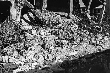
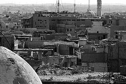
Every picture in the system so far is an object on a white seamless: a dove, a glass, an olive branch. The corpus is about real places, and an institution paying for it will expect to see one. One way to carry a documentary photograph in the brand’s own treatment, both on the same picture of a street in Mosul’s Old City after the war with the Islamic State, chosen because it shows a place and its damage and no one in it. It replaced a view across the Tigris on 16 October: its sky and water were one flat tone each, and the dither had nothing to work on; rubble is detail from edge to edge.
18 · A1Dark, monochrome, dithered, on a dark band · the glitchExplorationthe scene mapped through a compressed dark ramp · .vmap.doc-dark on .on-dark
A street in the Old City of Mosul, summer 2019, after the war with the Islamic State. Photograph: Levi Clancy, CC0, Wikimedia Commons.
Mosul, 2019
What rebuilding has worked after a city is fought over?
Evaluations of reconstruction programmes in post-conflict cities, read side by side, each finding traced to its source.
The Old City’s roofs, the same summer. Photograph: Levi Clancy, CC0, Wikimedia Commons.
Picked 16 October: 18 · A1 as the archive had it, with the first glitch (AR 20 · C in the archive). On a dark band the ramp is compressed and stops at 56% of the band’s ink, so the brightest thing in the picture is still darker than the type beside it, and the picture cannot compete with the headline. A second, smaller picture can sit under the first. Every two to six seconds, while it is on screen, a burst of four to nine frames slips bands of rows sideways, then the picture settles back exactly as it was; reduced motion leaves it still. The glitch is adopted as the one timed effect in the system, for documentary pictures only (16 October). The white and off-white pages, the colour screen and the other twelve glitches are in the archive (AR 20). Home’s corpus band is the first page to carry it, as figure.doc-fig with its caption.
Places, not suffering
Show the place and what happened to it: streets, buildings, a river, a market reopened. Never casualties, never a person in distress, and no identifiable face without consent. A brand sold to institutions earns trust by restraint.
Always named and dated
A documentary picture is evidence, so it carries what evidence carries: where, when, and who took it, in the caption under it. Open-licence pictures are credited even when the licence does not ask.
One per page, as a figure
Tier three: framed, square, beside copy and never behind it. On a page that has the hero veil, a documentary picture is the second and last image tier on screen.
Pl. 19The floating barDecided 16 Oct · 19 · B, centred
A bar that floats, and gets out of the way.
The top bar as an object: set in from the top and both sides of the window, with an edge round the page tone, opaque (made so on 16 October: a translucent, blurred bar is the glass every generated page wears). Scrolling down, it pulls in to the logo alone, dove and wordmark, centred on the page (19 · B, 16 October; at the body’s left edge was 19 · A); scrolling up, tapping the logo, or tabbing into it opens it again, and at the top of the page it is always open. The logo never moves, so the eye has nothing to follow; only the bar’s right end travels.
Pl. 19The floating barExplorationscroll inside the frame · .fnav[data-fnav]
Peace Intel
Decisions on peace and security are too important to leave to chance.
An evidence library, made answerable. Ask a real question and get a traceable answer.
Decades of evidence, in one queryable place.
Over 5,000 curated papers, evaluations and policy analyses, fully parsed.
5,000+ curated sources
Papers, field evaluations and policy analysis.
Answers, not documents
It follows citation chains and compares findings.
Named, cited, traceable
Every claim links to the study behind it.
Two kinds of decision.
For funders deciding where the evidence already points, and for implementers asking what has worked in a context like theirs.
Get early access.
The pilot opens to funders and implementers first.
A bar with a margin is an object over the page, so it obeys the object rule: an edge round the page tone. A full-width bar is part of the page and has only a divider under it, as .nav does today.
Why it compacts
On a long page the bar is read once and then only needed to get home or to act. Pulled in to the logo, it stops covering the column, which matters most on a phone, where a full bar is a sixth of the screen.
What it costs
A small script that watches the scroll direction and opens the bar when the dove is tapped. On a page that snaps (Home) it compacts on the first screen change.
Decided 16 October: it compacts to the logo alone, dove and wordmark, and tapping the logo opens the full bar. It is on Home, the first page to carry it; Landing and Rotary keep .nav, and the console keeps its fixed bar, which is part of the app shell.